{As an artist, I dream of weddings in compositions – much like a painting.}
Balance, sheen, negative space all play into stationery design. An invitation is really a composition, just like a landscape or architectural study – so many factors to consider and at any moment you can make or break the look.
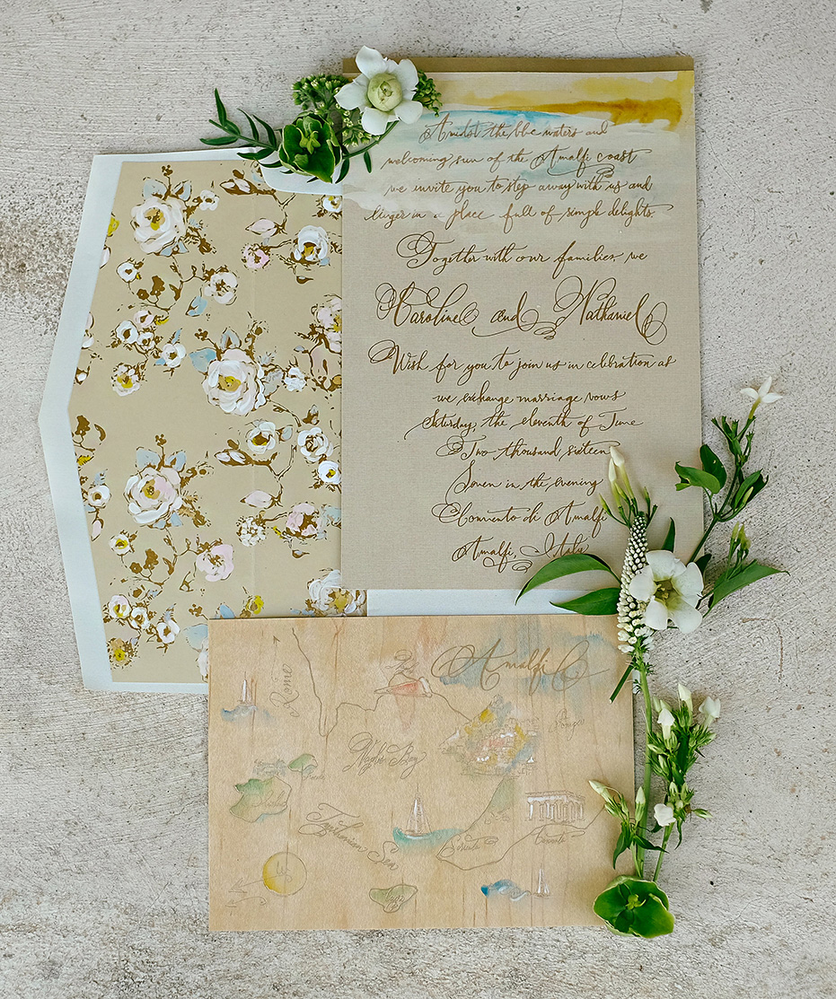
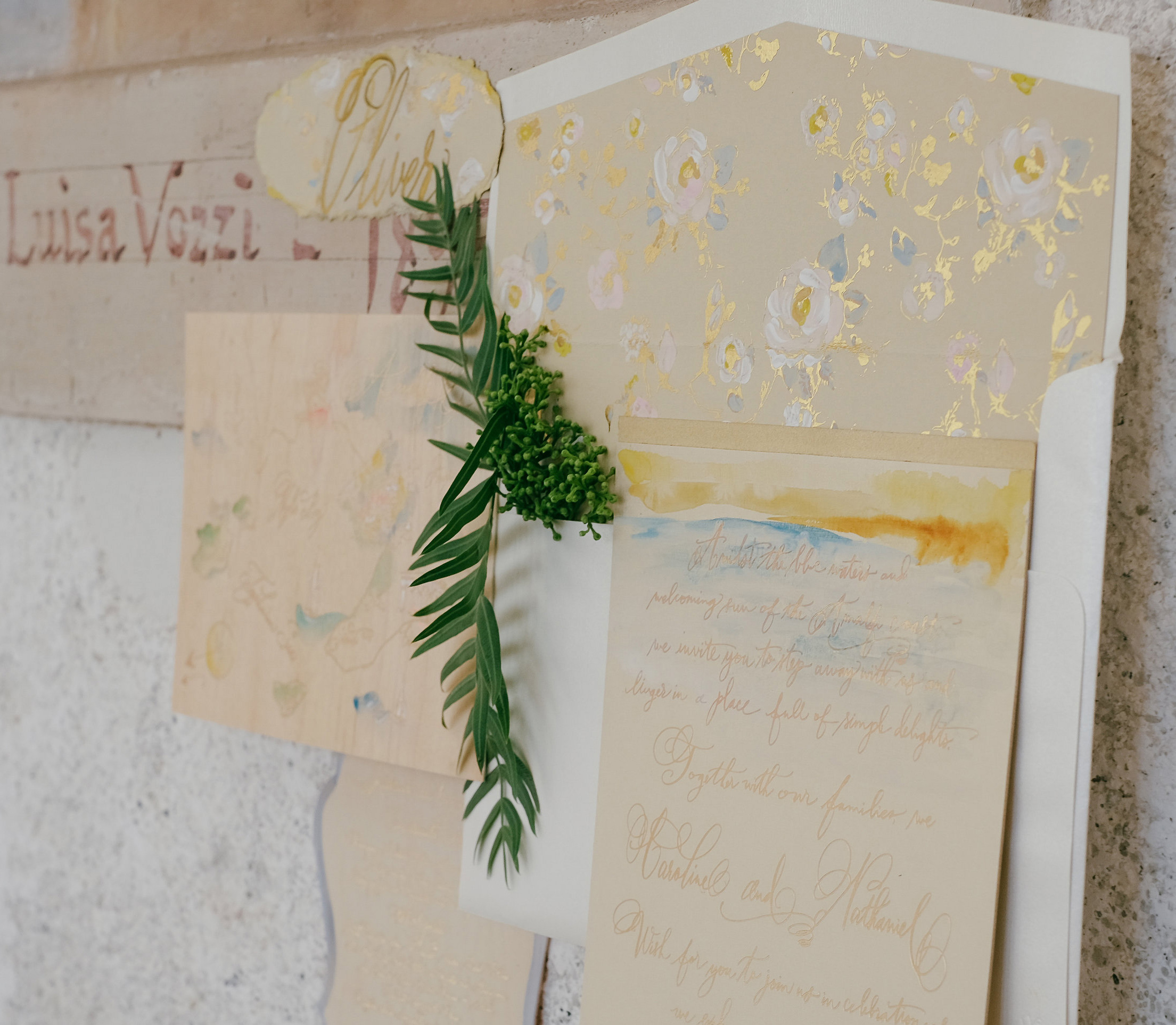
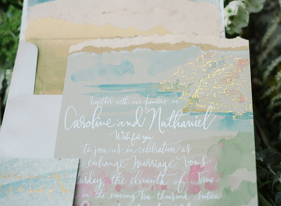
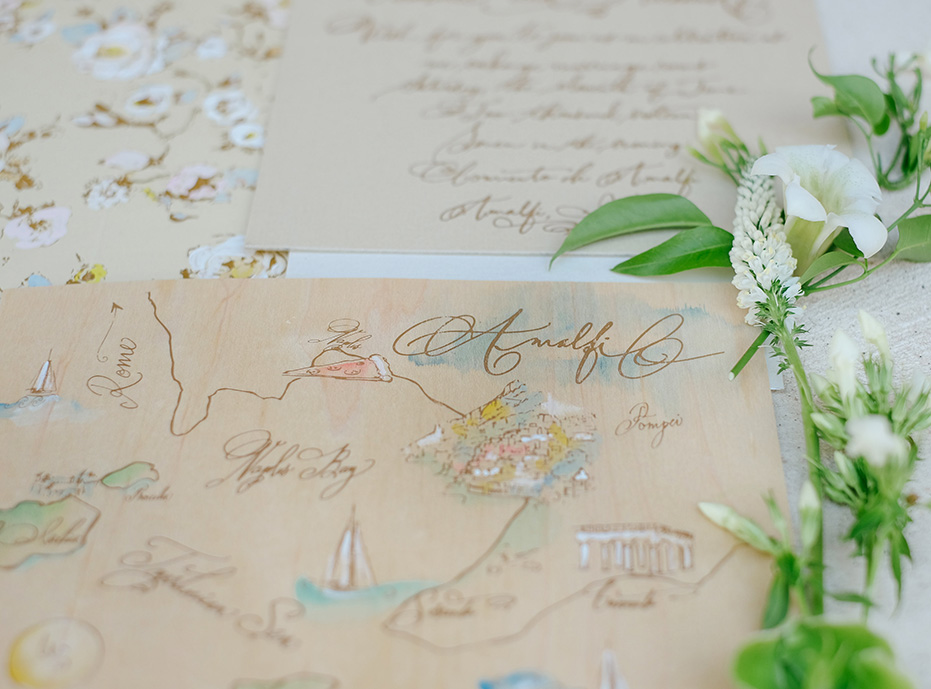
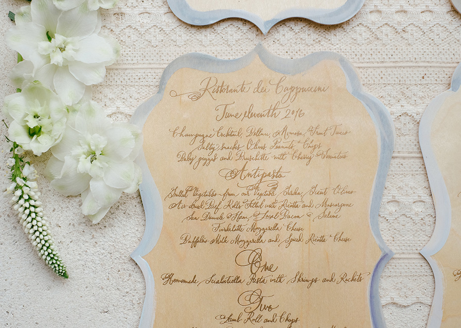
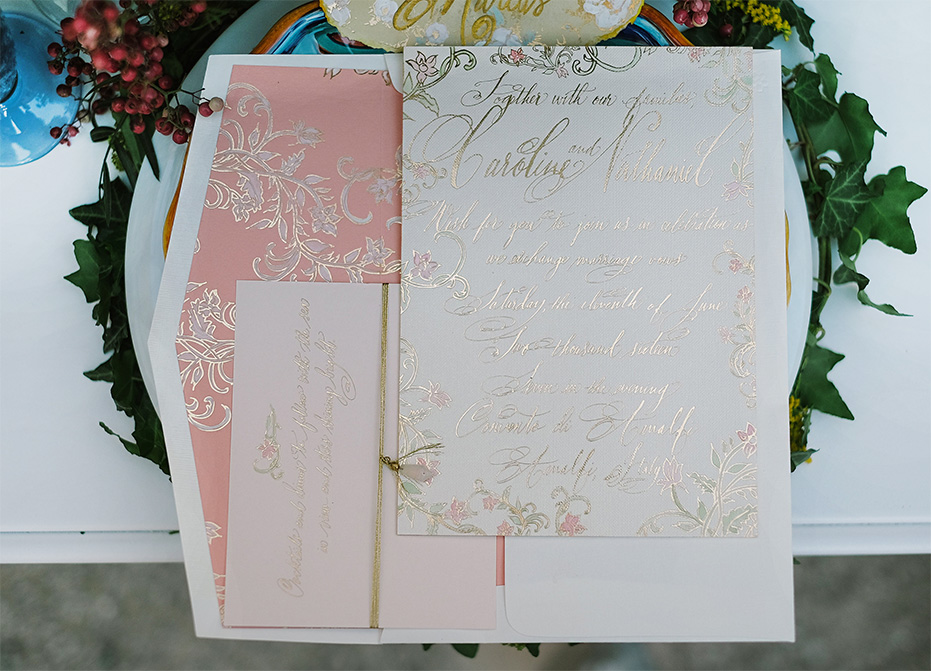
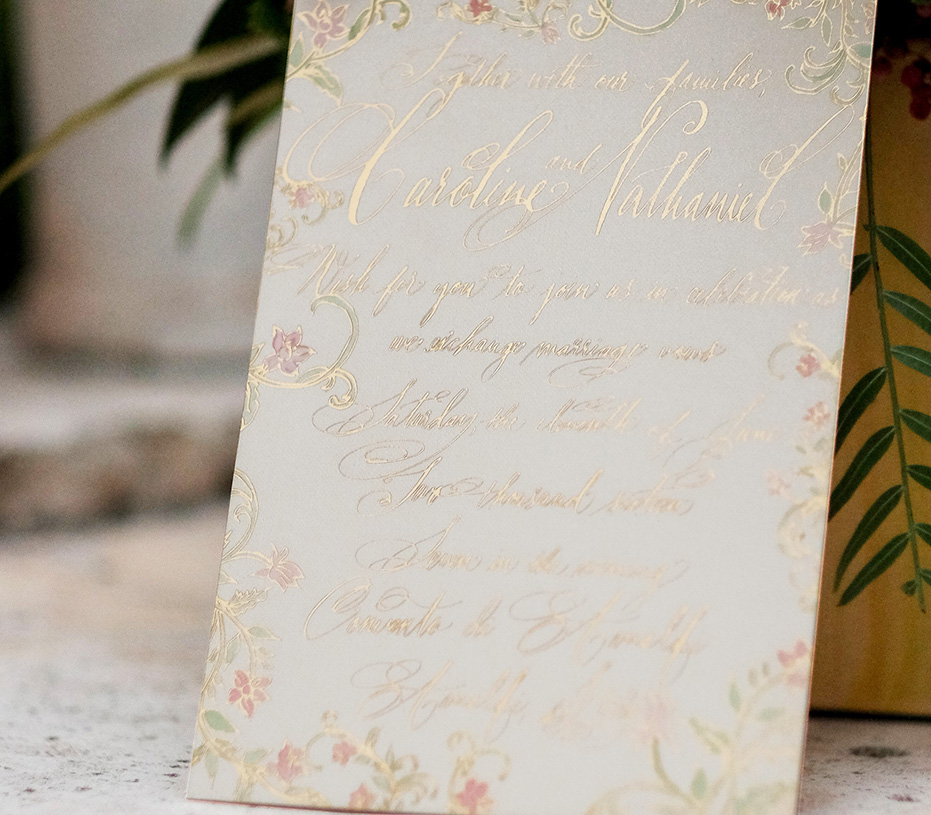
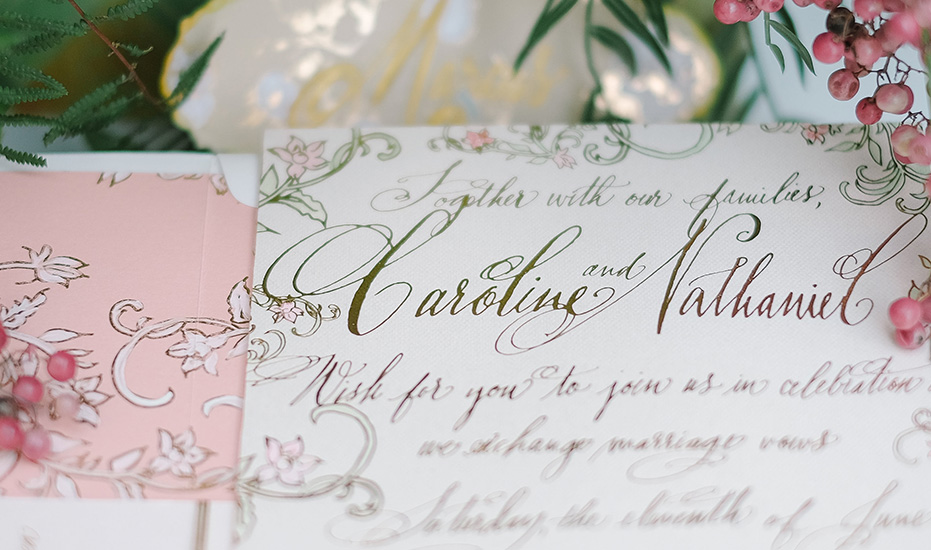
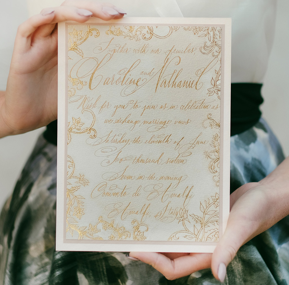
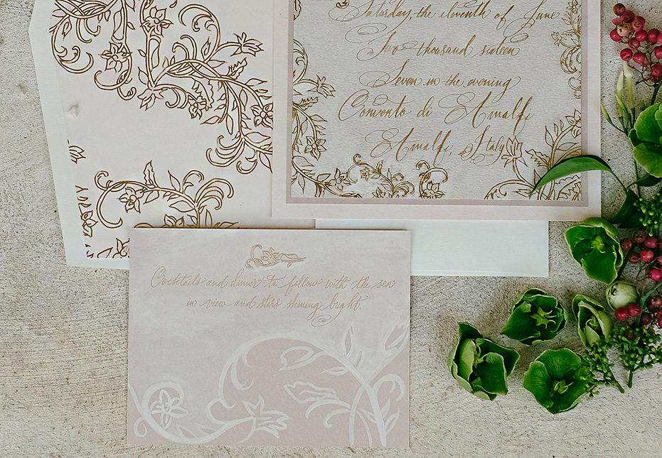
Stationery for our editorial shoot in Italy my kind of simplicity which for some, is likely still too much, but that is, friends, what makes the world go round…right? I come from a more is more kind of background – my childhood home was full of color, textures and pattern upon pattern layered. Our walls were covered gallery style and every little nook and cranny was lovingly tucked with meaningful bits.
{My artistic roots are are firmly planted in a sort of visual fullness not scarcity.}
So here I am all grown up, trying to balance my urge to add just one more brushstroke or that extra layer of sumptuous cardstock. Italy Art Shoot was a successful study in restraint. Aren’t you proud of me??
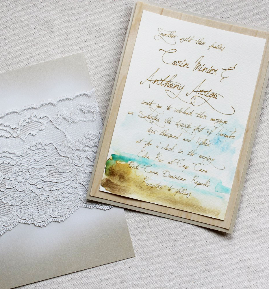
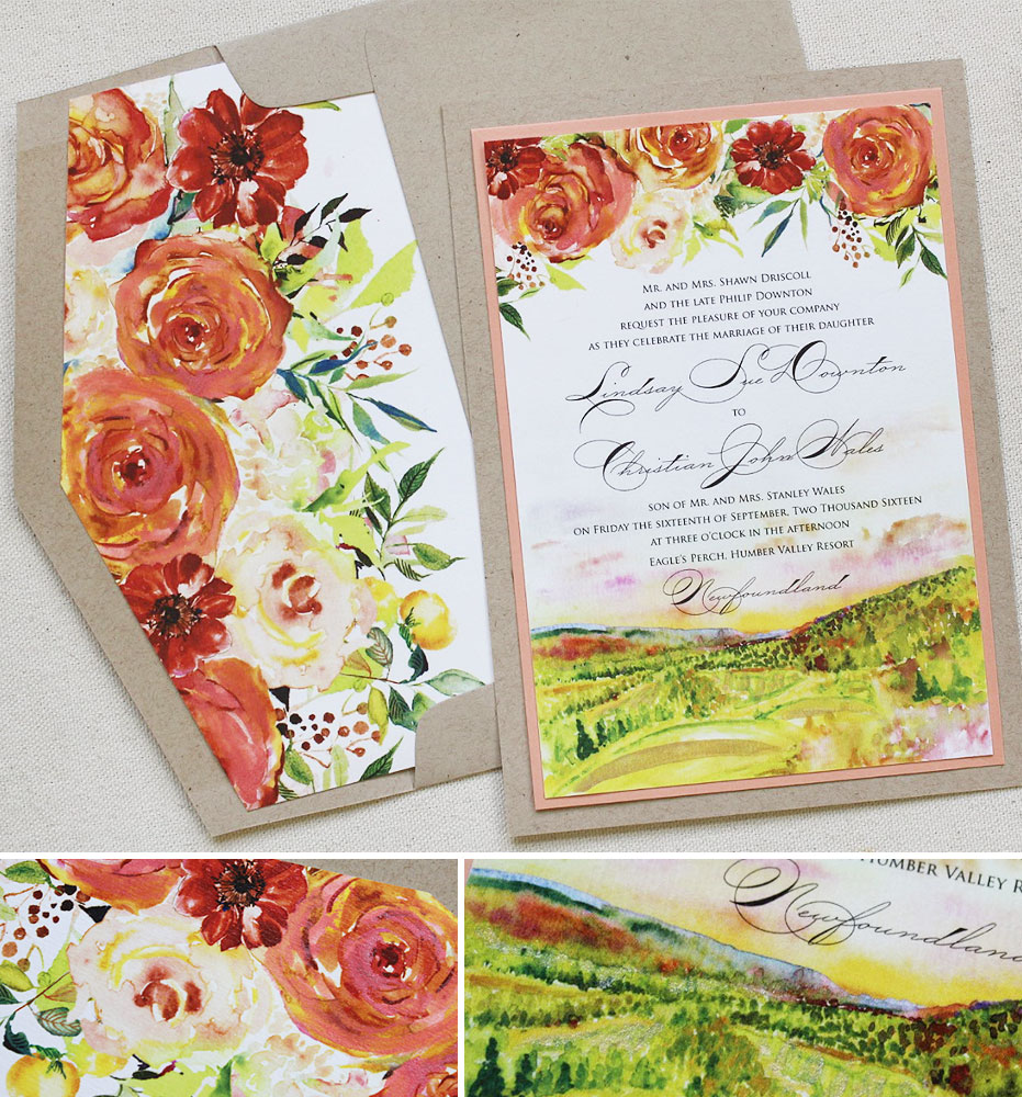
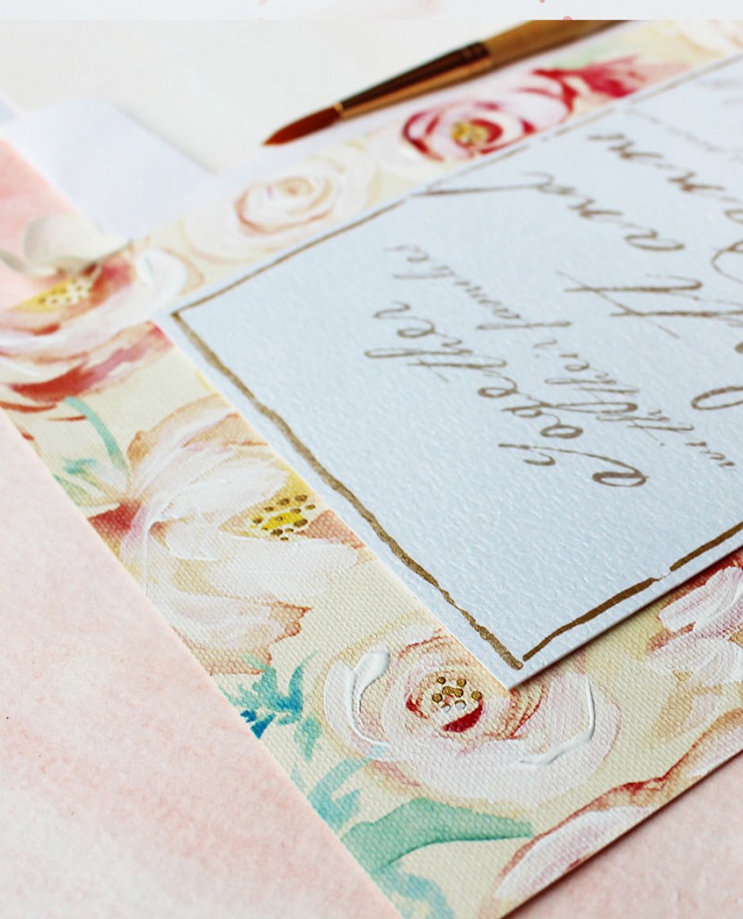
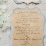
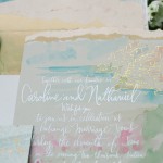
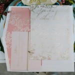
So these four Watercolor Wedding Invitation suites from Italy are a lesson in balance – almost too much paint in places but not quite…Just enough pattern on an envelope liner to make you want to see it again, and… again…
Good art, impactful art, makes you want to see more. Artful experiences create a sort of mystery and anticipation. Artful invitation, like these, don’t reveal everything worth seeing all in one glance. How refreshing I think, since so much these days isn’t left to the imagination.
Did you miss Part I?

 View the Gallery
 Vendor Credits
- Photographer
- Detito Photography
- Styling
- Kristy Rice
- Calligraphy
- Designsgirl
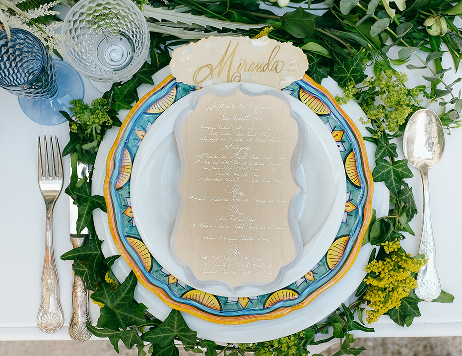
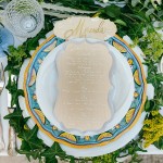
- Place Settings
- Pascal Ceramiche d'Arte - Ravello
- Glassware
- Gemelli srl
- Cover Gown
- Tara LaTour, After the Storm Collection