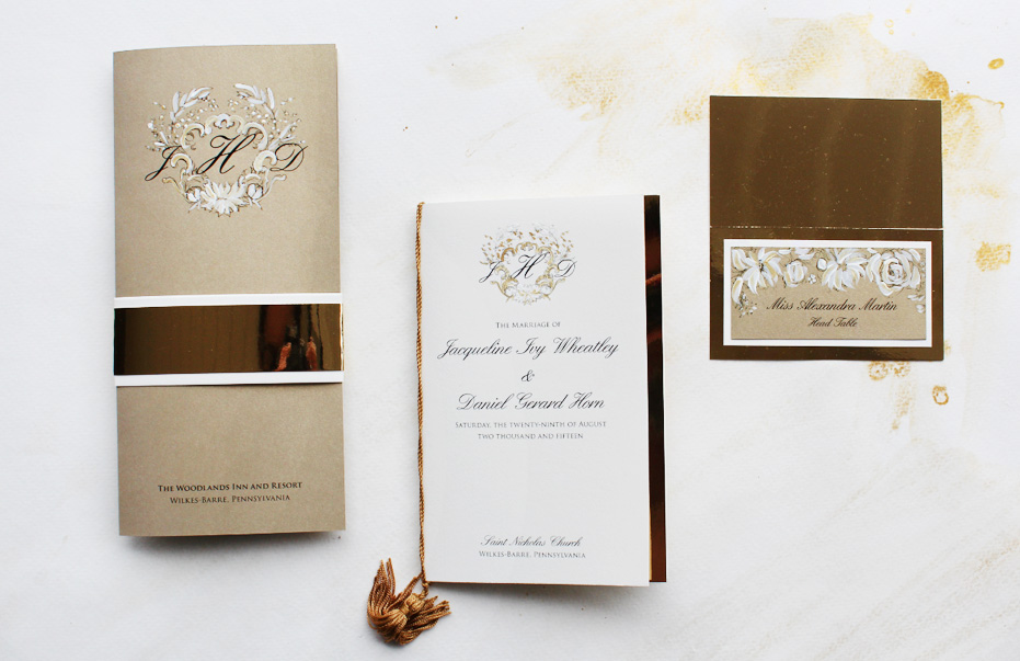
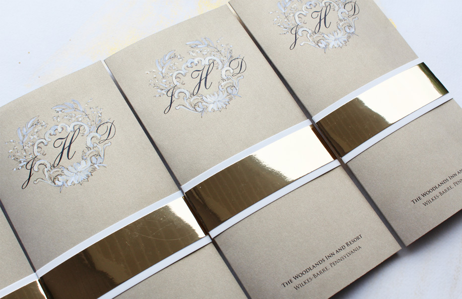
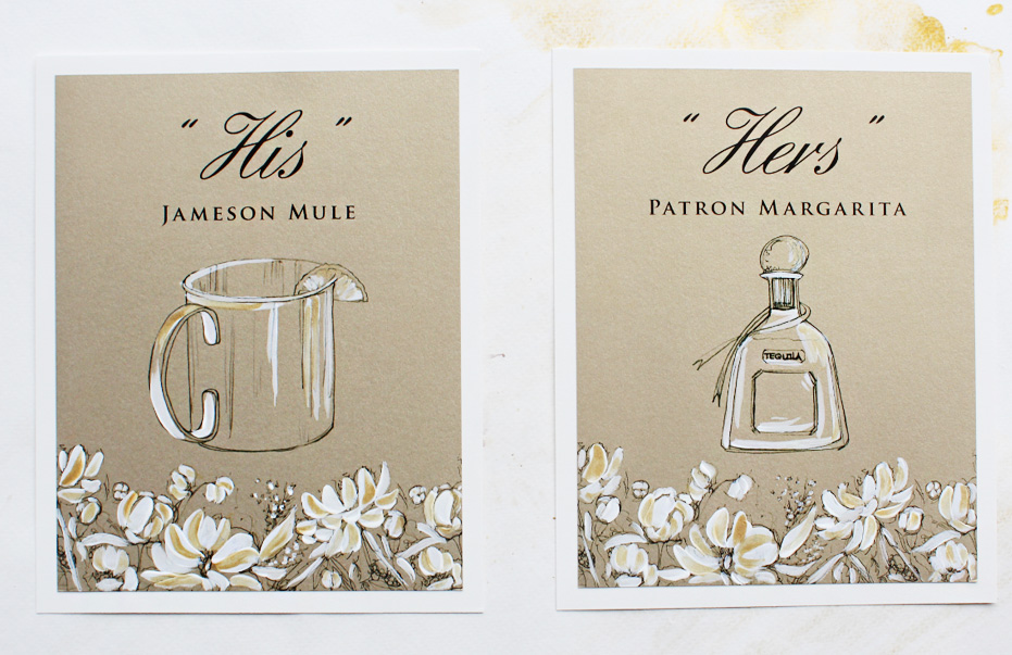
We’re not all about color and bold statements over here. We firmly believe you can be just as bold with a muted, understated palette as you can with anything else. Recently we created pieces for a black tie celebration where gold and cream tones reigned high.
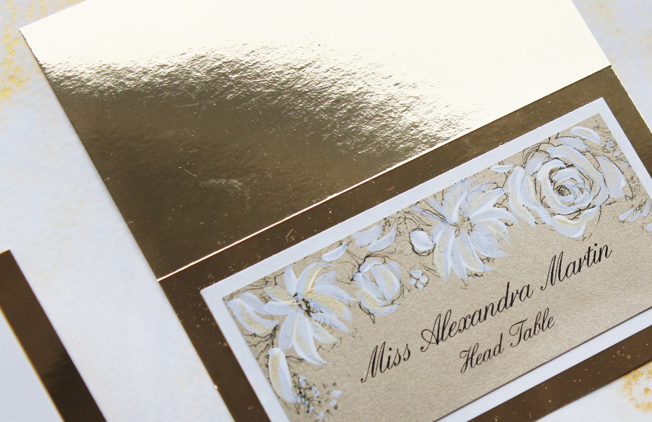
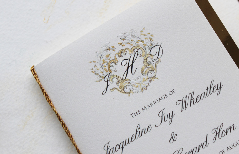
{Lavish and painterly brushstrokes adorned the couples regal monogram and floral details throughout the suite that included Regal Gold and White Wedding Menus.}
Our favorite detail these days…? You guessed it, the mirror cardstock…Oh this stock adds such a level of drama when used precisely in the way it was meant to be used, which in our opinion is “in moderation”!