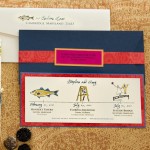
So I’m back to dive in deeper to the stationery I created for My Best Friend’s Wedding. I warn you, I took every opportunity to express myself and this couple on paper so there is no shortage of painted paper detail here. The save the date was all about introducing guests to #1, the bold color palette and #2, poke a bit of fun at the curious wedding venue the couple chose….yup, look closely, no joke.
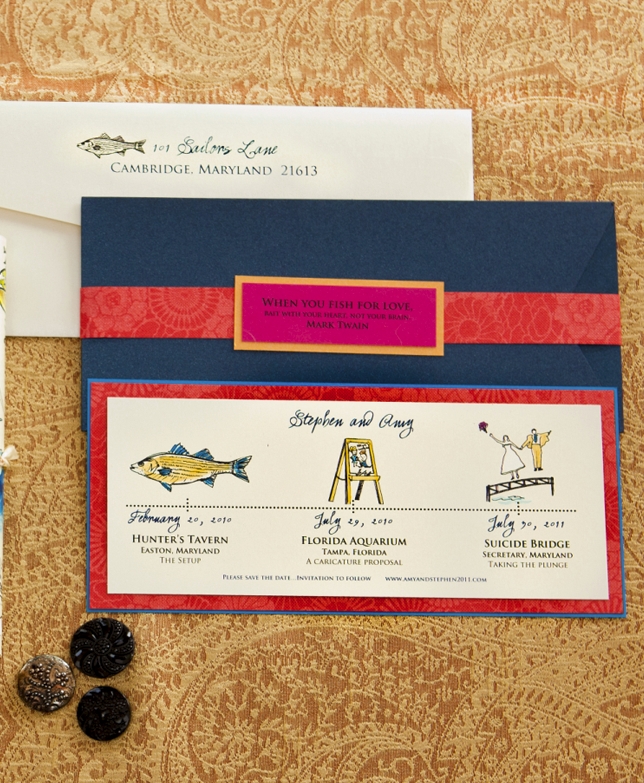
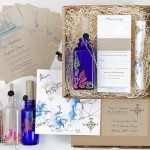
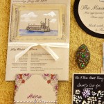
The Message in the Bottle Wedding Invitation Design is one I’ve talked about before but I just can’t help myself…talking about it again. From vintage riverboat sketches and painted bottles to black glass buttons and abstract, monochromatic painted blooms; this suite was an attempt to corral Amy’s many stationery obsessions in one place!
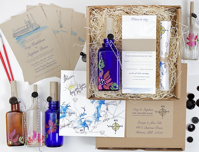
Ceremony programs were huge…the Groom loved the feel of vintage cruise itineraries and old newspapers so wanted to infuse those details into his own.
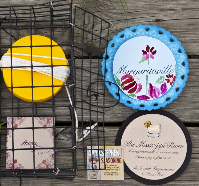
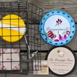
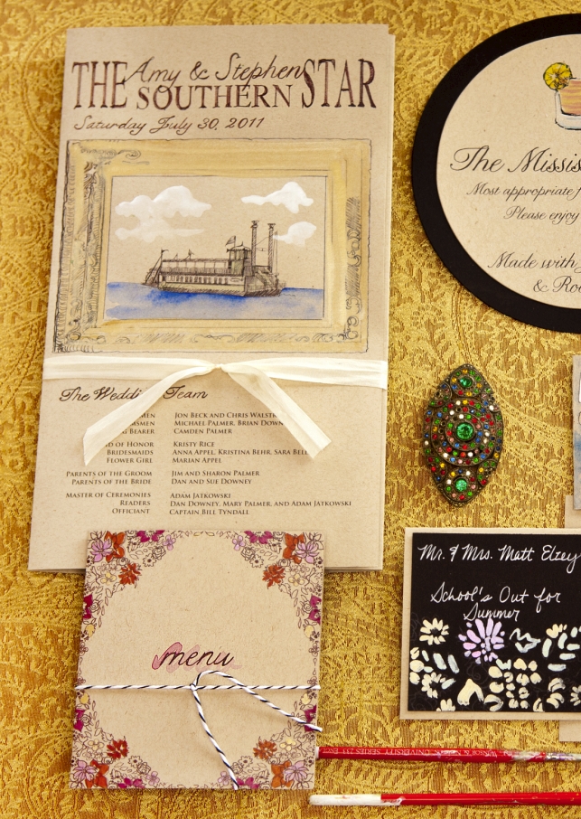 Stationery shot in a lobster trap, yes indeed!
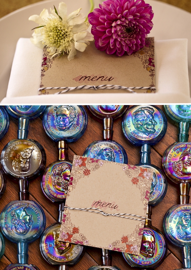
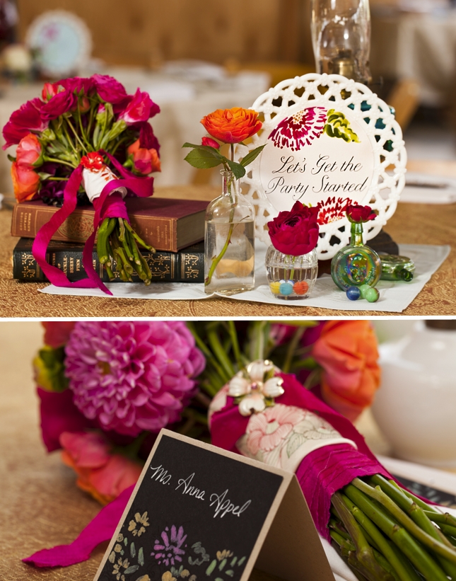
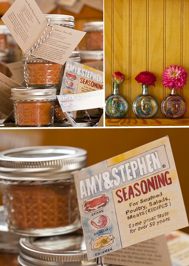
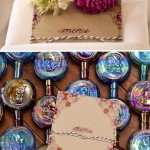
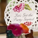
I created an eclectic suite of artwork to be used throughout the wedding day. A sketchy pattern of blooms and leaves made an appearance on the menus and various signage throughout….Each was individually hand painted with fuchsia and gold inks. You’ll notice these Carnival Glass President bottles; the Bride and Groom loved, loved blue Carnival Glass and continually found this little bottles when hunting for goodies …we ended up with a ton of them so used to style a lot of fun shots. They are just so fun and colorful!
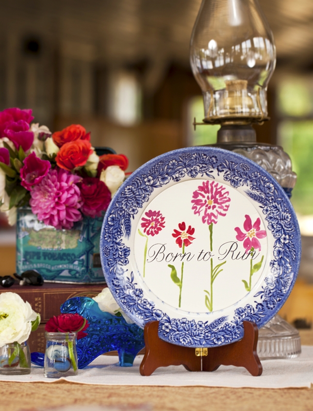
Each centerpiece was a unique assemblage of oil lamps, books, glassware, blooms and painted paper. Along with the couple we organized every centerpiece ahead of time – each table was assigned a prop box. On the day of setup, we simply pulled the pieces and arranged, allowing us more time to play with the fresh blooms waiting in buckets for us.
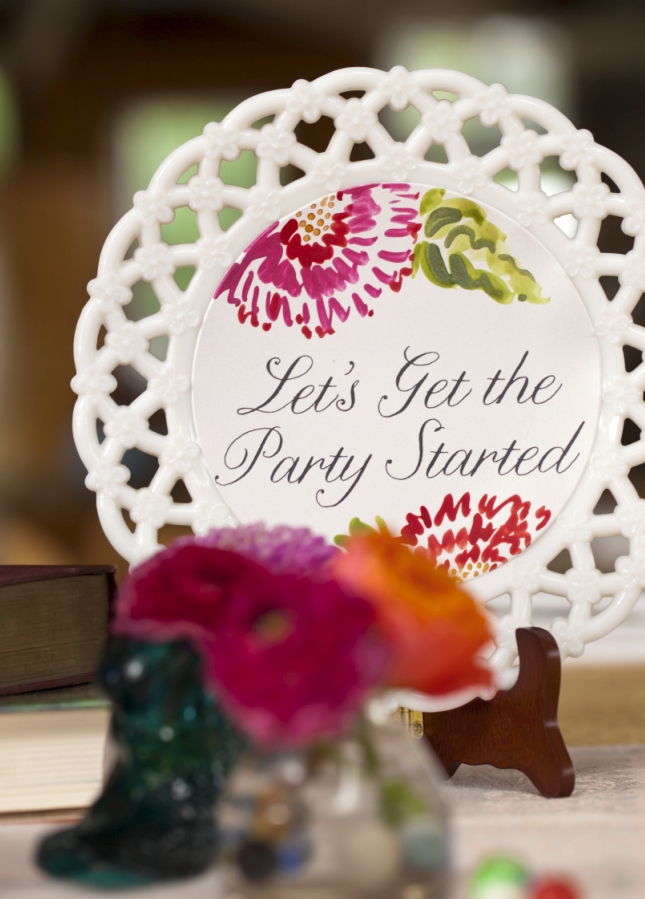
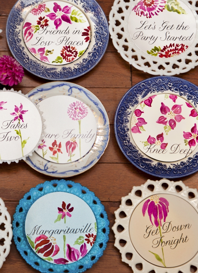
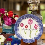
Each table number was painting against a curated set of vintage plates. Free hand painted blooms reminiscent of roses and dahlias.
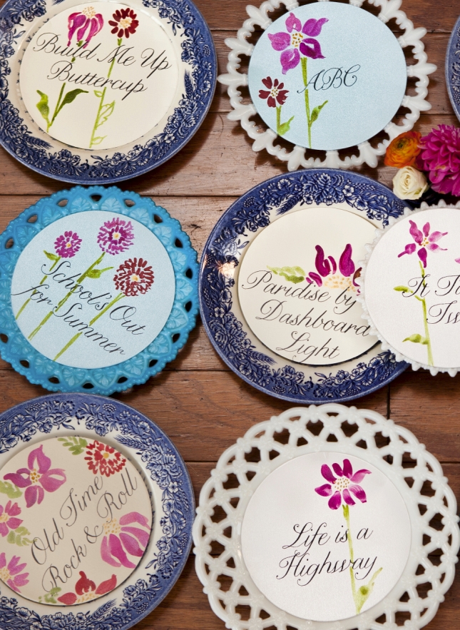
Notice the Carnival Glass bottles again! They popped up everywhere!
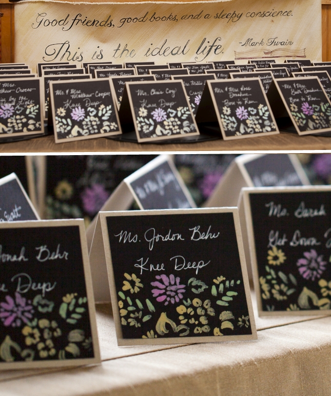
Seating cards revisited the painted pattern from the menu card but against a black backdrop – essentially creating a blackboard effect. The Bride actually made time to to handwrite each in white!
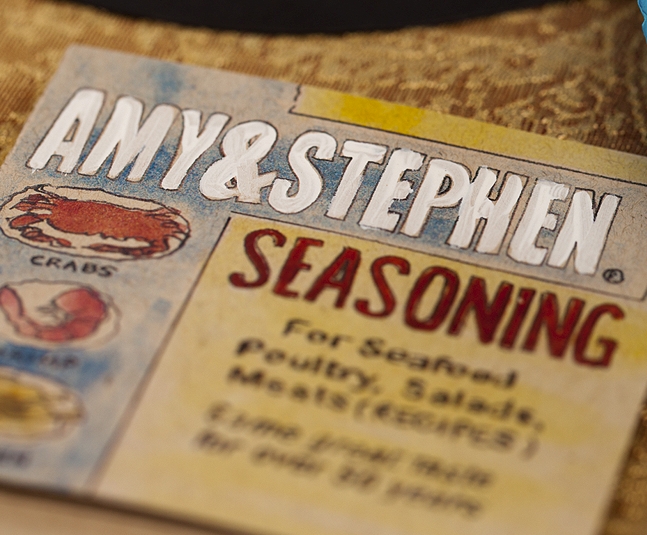
Stephen, the Groom is huge cook and LOVES Old Bay Seasoning. So much in fact, he made is own version of the spicy blend for each guest to take home. Of course I had to design a tongue in cheek favor tag!
Venue – Suicide Bridge Restaurant, Hurlock MD :: Photography: Daniel Bostwick Photography : Styling, Stationery and Design: Momental Designs :: Flowers: DIY with www.FiftyFlowers.com (fiftyflowers.com is a respected RiceInk advertiser) :: Linens: LaTavola Linen :: Vintage Parasols – Bella Umbrellas
 View the Gallery
