On Monday I shared some stunner images from a project with Kate Miller recently seen on Style Me Pretty. Gold and purple was the color story and eclectic natural surroundings were the space this shoot unfolded within. Geodes in all their glistening glory were used everywhere from the cake to the bride’s jewelry…Each place setting in fact featured a thin piece of violet hued material.
The stationery collection created relied heavily on the idea of ombre. You know ombre, that lovely concept where dark tones flow into light with stunning subtly? Just this week Design Sponge posted a look into the history of this curious trend. Look on…
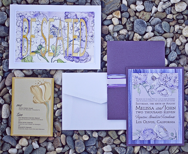
Seen here is a sketched bouquet of hydrangeas, peonies and poppies painted in creamy inks against lavender shimmer papers. A watercolor stripe custom pattern found only at Momental is a pretty way to add loads of texture and dramatic color to your wedding invitations. 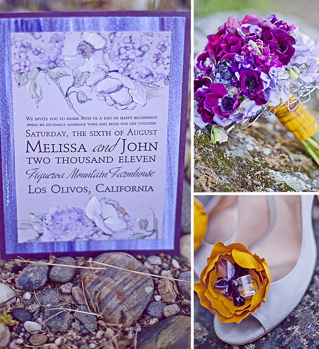
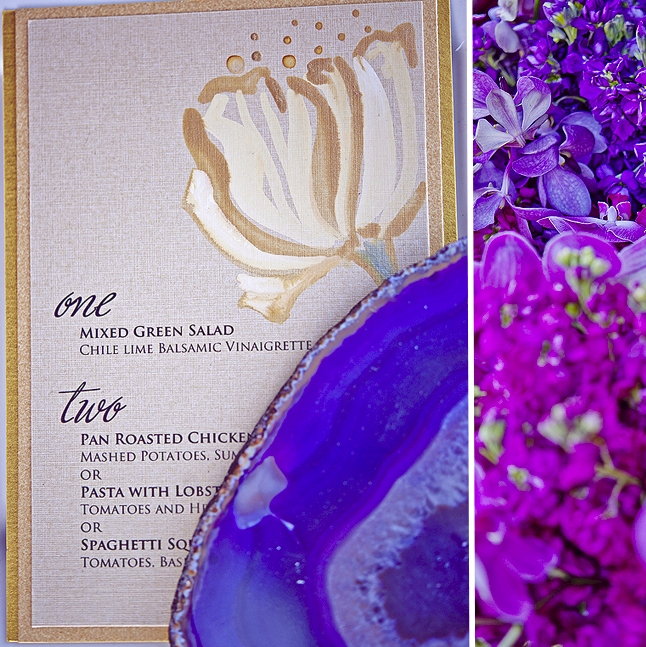
Table menus on a lovely gold shimmer linen stock with free hand painted blooms in golden inks.
Kate’s sister company LuxeCuts™ offers innovative options in plexi for table numbers and seating cards. Here we painted ombre stripes onto each.
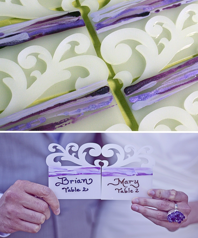
An escort card table sign in shades of gold and purple…
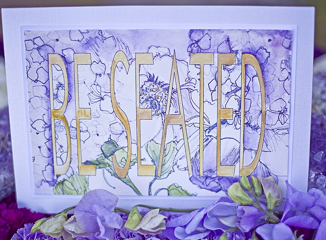
So a big thanks goes to Kate for inviting me into this project and letting me be as creative as I liked. Also, hugs to Sarah for capturing my pieces in such a lovely light!

