In honor of my quick stop in Vegas this week I thought sharing this fun design created just after my trip to Vegas last October.
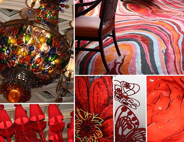
After spending several days at The Encore, Las Vegas last October, it was difficult not to come home with a head full of inspirations and ideas. I spent one afternoon slowly walking around the casino, sketching and snapping pictures. What is most striking is the manner in which the design evolves as you experience the space. Check in is alive with massive red flowers and natural light, while the casino space is darker and dramatic with its heavy light cast by red shaded chandeliers. Intense color everywhere was balanced by opulent golds.
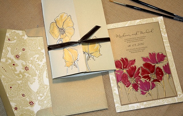
Most inspired by the massive blooms at check-in, I envisioned an invitation just laden with rich red blossoms. The gate-fold design opens to reveal a layout featuring strong strokes of shimmering red inks and gold painted stems. A stunning gold paisley cardstock adds to the opulent feel overall.
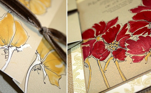
The red poppies here are completely hand painted with rich, juicy red, raspberry and gold shimmer inks. Perhaps what is most unexpected about this design is the level of sophistication that can be achieved regardless of bold, bright color. The mindset has changed and this colorist is thankful. No longer is elegance only equated with stark white or ivory palettes – thank heavens 🙂
Among the several kinds of beauty the eye takes most delight in colors. ~ Joseph Addison
Are you using color freely in planning?


