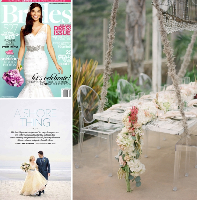
I know when the following two things happen my world is about to get so much more interesting: 1. I get the chance to work with Cortnie from Canvas and Canopy Events 2. She uses the words “Ghostly, shipwrecked, ethereal, romantic, glam” to describe the project’s aesthetic. Yes, indeed. My team and I were lucky enough to be part of Cortnie and Donny’s dream wedding design team and the fruits of this labor were recently seen first in BRIDES Magazine, then on 100 Layer Cake and Green Wedding Shoes! So I’m excited to finally share more about the amazing painted stationery journey.
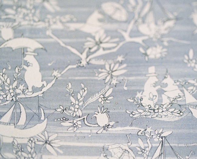
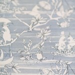
Inspired by the invitations, I sketch bears, umbrellas and whimsical flora details to whip up this cheerful Chinoiserie pattern. The gray watercolor background textures prevented the pattern from becoming too sweet.
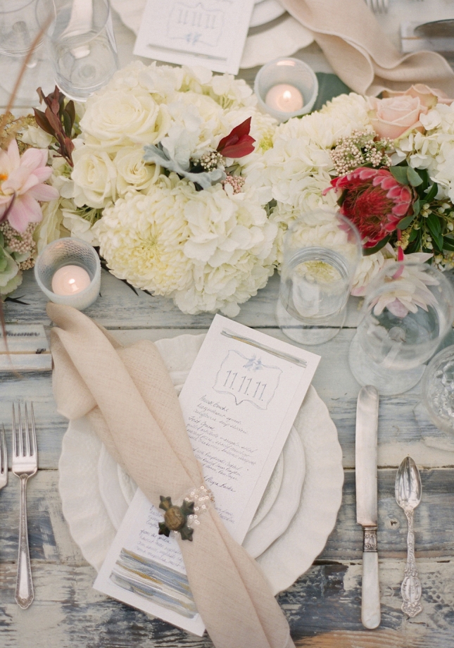
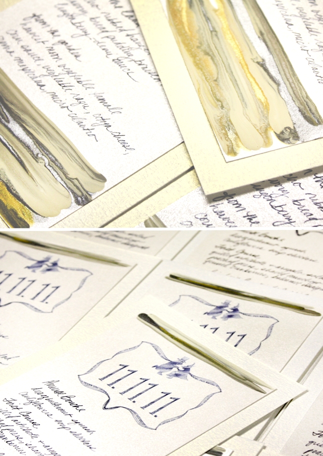
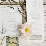
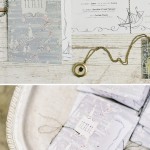
Play on texture and finish was just as important for the project as creating with unique materials. Each menu featured prints of a handwritten menu (my hand of course) with a modern shield at top and organic + painterly stripes of gray, taupe, white and gold.
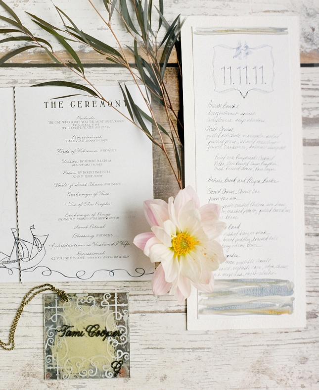
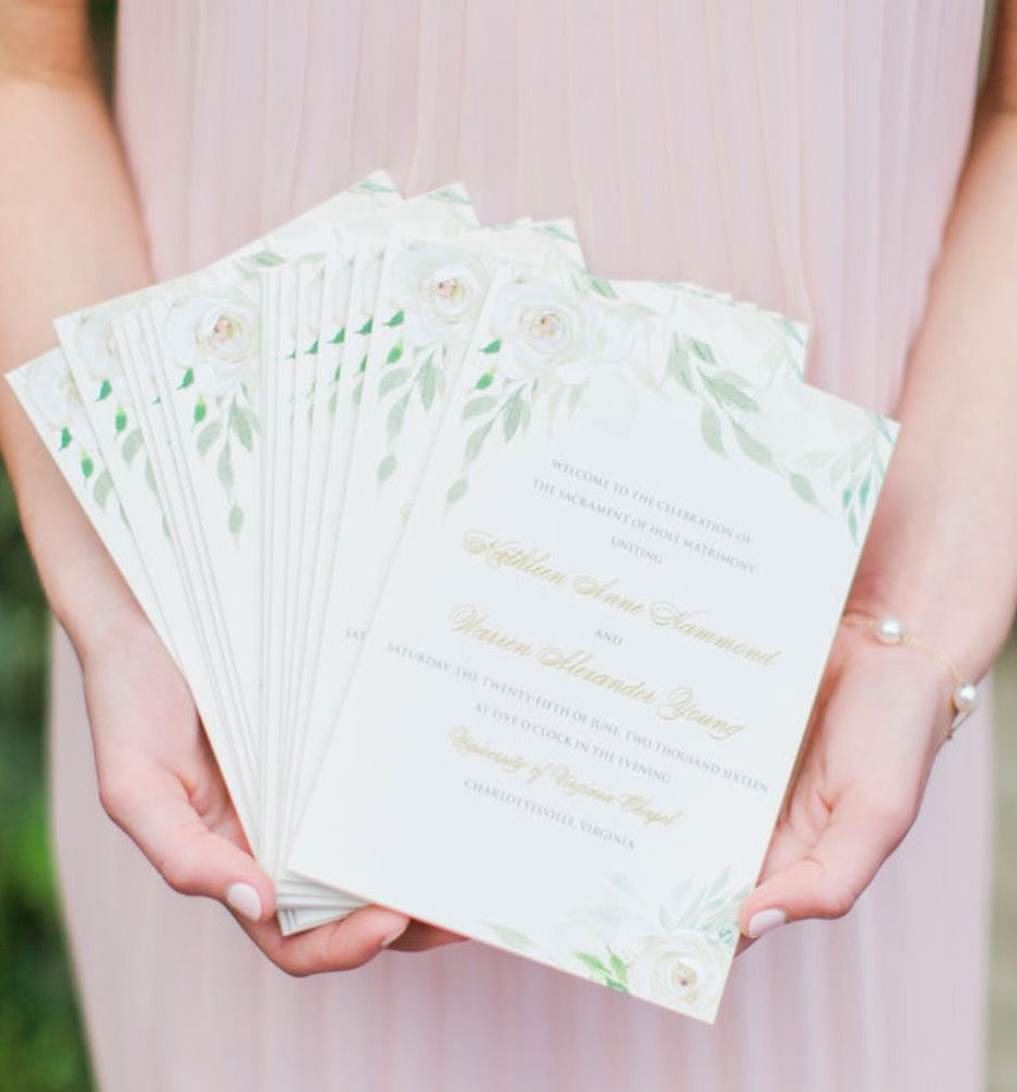
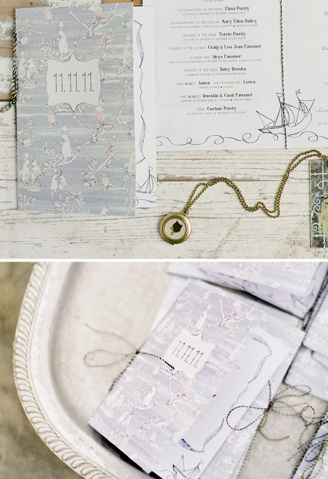
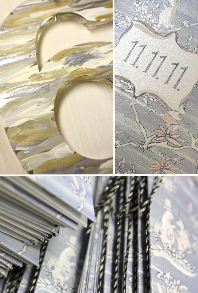
Ceremony programs featured the custom Chinoiserie pattern again but this time detailed with brushstrokes of ivory and blush – such a lovely touch against the shimmering white stock used for each.
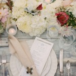
Perhaps my favorite shot of the day…
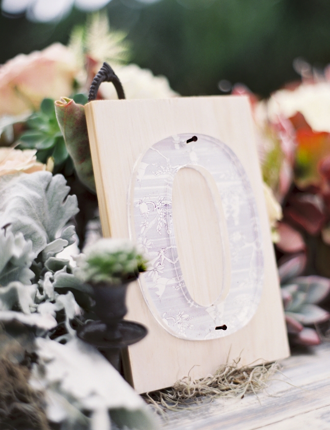
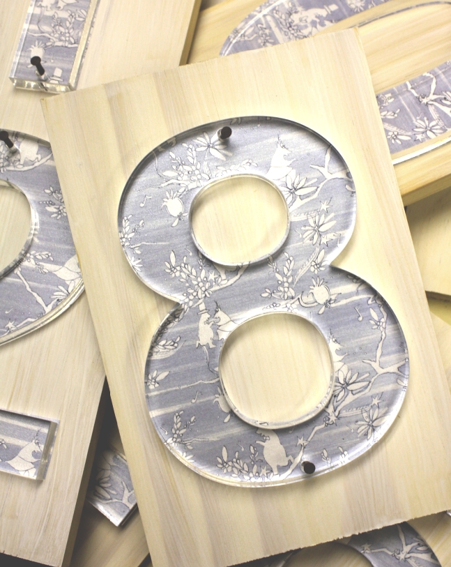
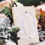
As with much of this suite, Cortnie let me play and experiment – so for table numbers I knew I had to envision something pretty incredible. Material was so important for this wedding so my thoughts quickly went to concepts of plexi, wood and experimentation with scale. Cortnie seemed big into contrast so I wanted a table number that had softness and sheen but also one that would contrast in scale and finish to the softer florals being used throughout…
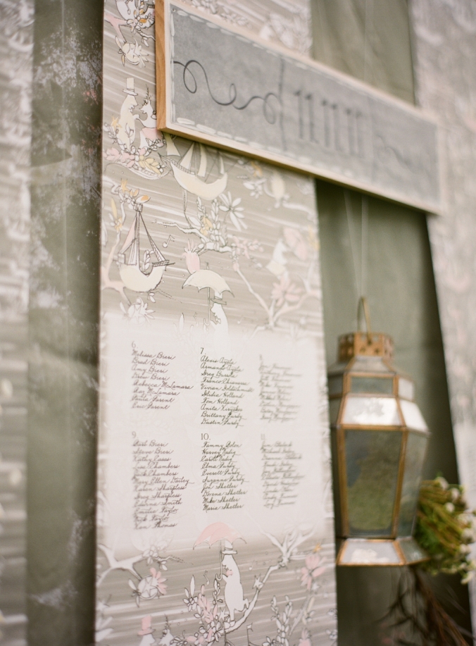
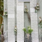
Again, I was given free reign to come up with a seating plan concept to wow. Installation artists from my college years inspired this concept where long scrolls of patterned paper were installed and left to puddle on the ground. The Chinoiserie pattern in varying scale was printed onto each along with guest names…
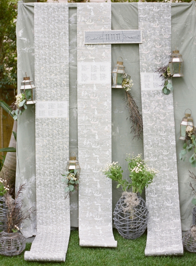
Of course we had to add hand painted moments throughout the 40 + feet of scrolls….
Bar Menu!
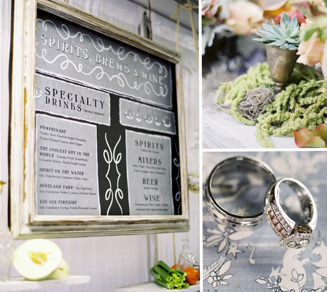
And finally a few images of my own from production week. I can’t get enough of the painterly treatment on the menu. Wet and wet is a technique where various shades of ink, paint, etc are combined and manipulated on the page while all are still wet. Magical things happen when one color puddles into another…
More on the table numbers…each plexi number was mounted to bulky wood panels. Some numbers featured the Chinoiserie pattern while others the painterly treatment.
Thanks again to Cortnie and Donny for inviting me to create for their day!
Photography – Jose Villa Photography :: Event Design & Styling – Canvas & Canopy Events :: Event Planning & Coordination – The Special Day :: Floral Design – Studio Fiore Design :: Vintage Furniture Rentals – Found Vintage Rentals :: Calligraphy: Laura Hooper :: Vintage Dinnerware, Glassware & Flatware – Casa De Perrin :: Modern Furniture Rentals – Hire Elegance :: Table Linens: Wildflower Linen :: Event Containers & Props: Canvas & Canopy Events :: Event Stationery – Momental Designs :: Wedding Invitation – Printed Palette Ink :: Wedding Cake & Cookies – Cupcakes Couture :: DJ – The Flashdance :: Mixologists – Snake Oil Cocktail :: Hair & Makeup – Alexis K Brows :: Bride & Flower Girl Hair Pieces – Lo Boheme :: Canopy Bed Ceremony Structure – Designed & Constructed by Canvas & Canopy Events :: Custom Floating Table Designed by Canvas & Canopy Events & Constructed by The Timber Library :: Catering – Toast Catering :: Lighting – San Diego Events Lighting :: Bride’s Custom Wedding Gown – Joan Shum Brides :: Shoes – Jimmy Choo :: Grooms Suit – Theory :: Grooms Shoes – Salvatore Ferragamo
 View the Gallery