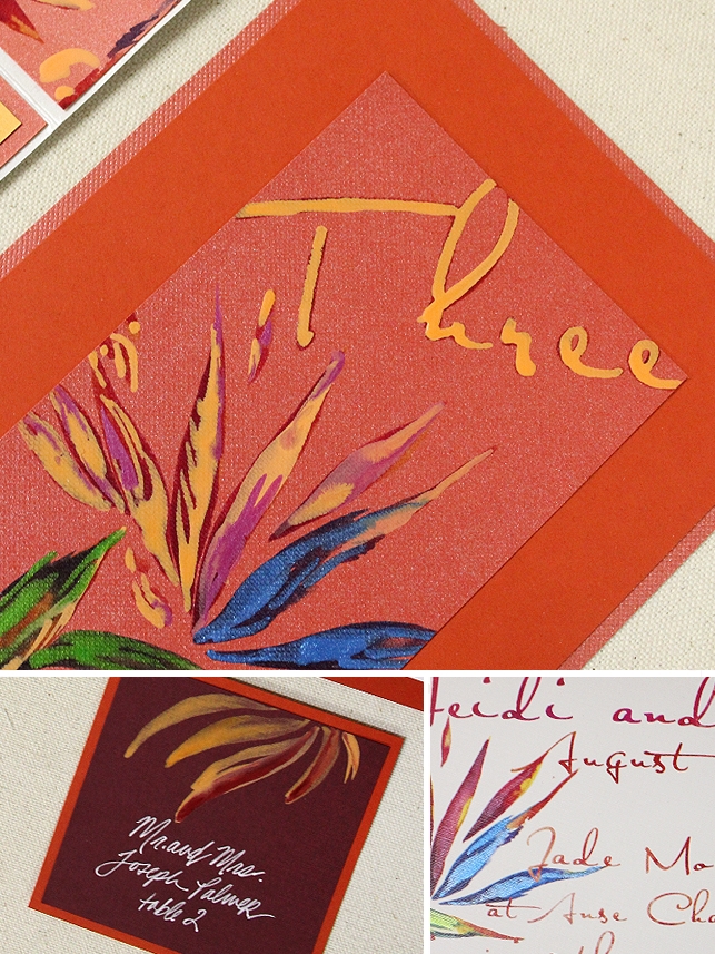
More today from my “A Week at the Beach Series”. I know you’ve seen our Bird of Paradise artwork before but not quite like this!!
This is the second suite designed for the summer issue of Inside Weddings. Wanting to put a spin on our Watercolor Bird of Paradise artwork, I printed it against a rich crimson stock and the painted lighter, creamier tones atop. The result is this intense pattern full of contrast used to line the interior of each Envelopments Pocketfold presentation.
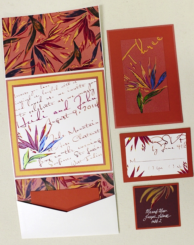
The contrast details went on to inspire the hand painted table number and place card too…
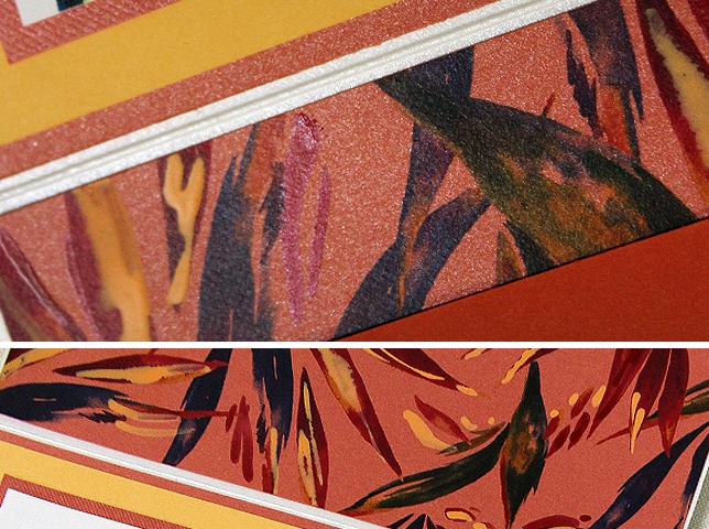
Close-up of this amazing pattern – I can’t stop looking!! Need to move to Florida and wallpaper an entire room in this!
Want to see more? Check out this design from last year’s series!