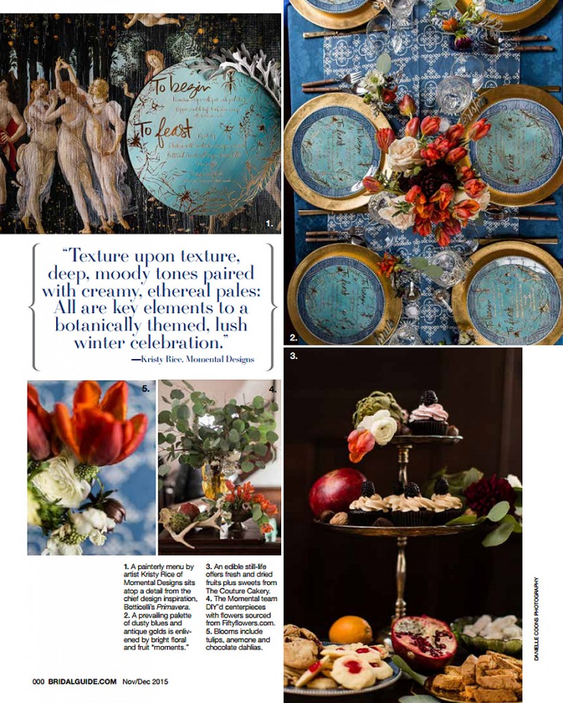
Press – Botticelli Inspired Stationery in Bridal Guide Magazine

You may have seen this post a few weeks back…and if not, go ahead, take a look.  I’ve been saving this post for the season and since Thanksgiving is upon us here in the states, well I figured it was just about that time.  All cozy and warm, this stationery’s color palette seems right at home as we near the middle of November.

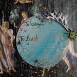
Every year I throw a bash for my team, to essentially let them know how awesome they are and of course for another excuse to pretend I’m an event designer!  Last year’s Botticelli Inspired Stationery was graciously featured in Bridal Guide Magazine earlier this fall.

{Each event we have the joy of being part of is a journey and for #themomentals, that journey begins with good paper and a brushed soaked with paint.}

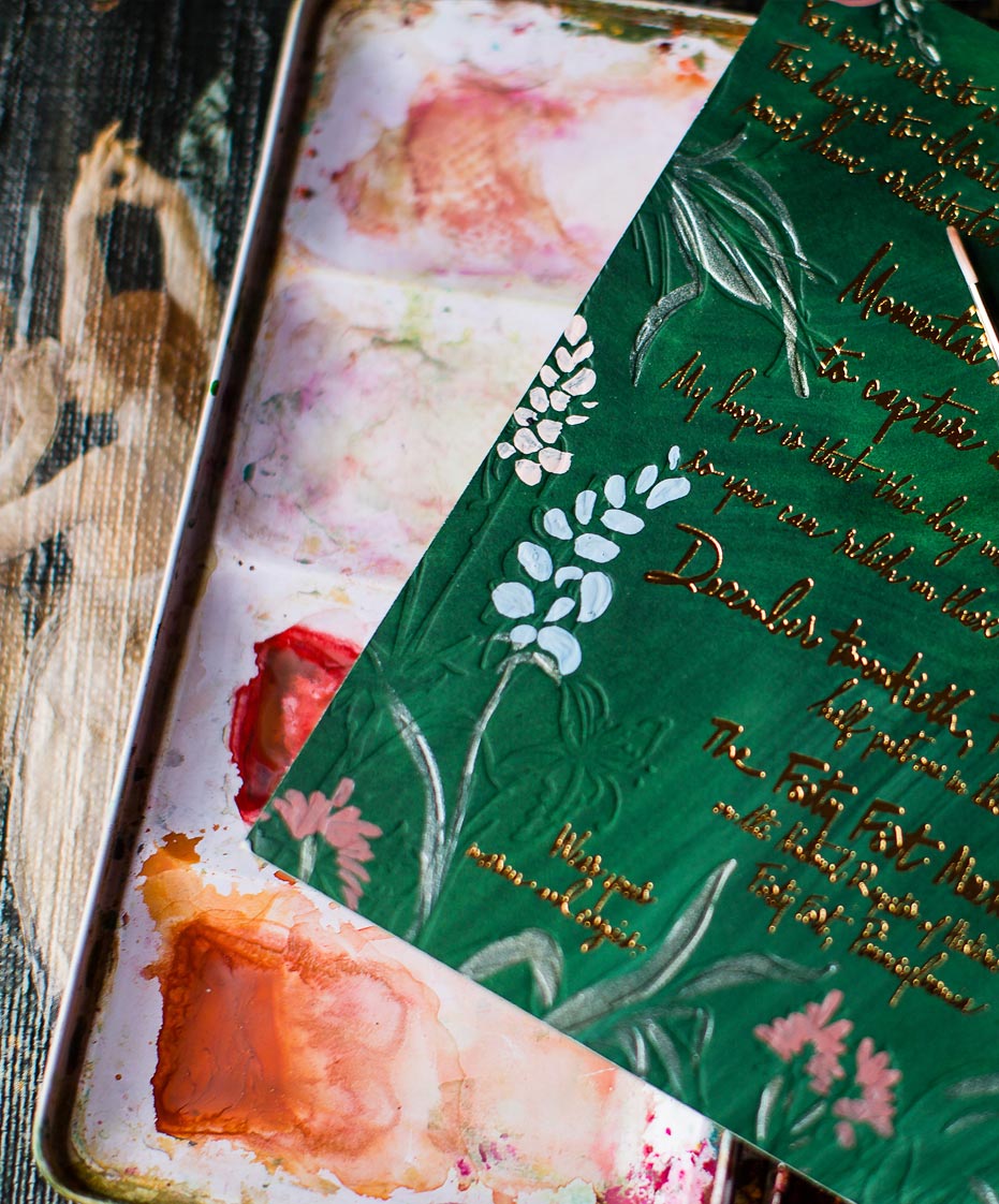
SO today I’m sharing the good paper and paint that began the journey to our celebration.
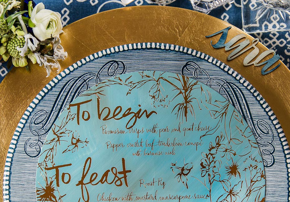
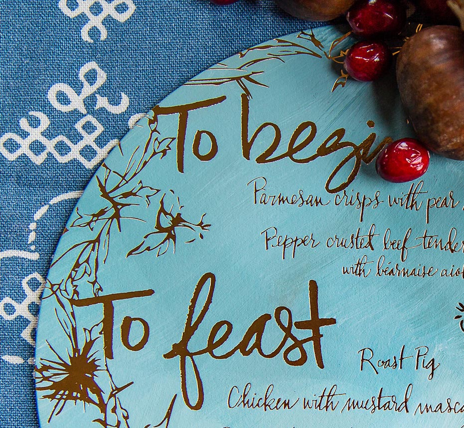
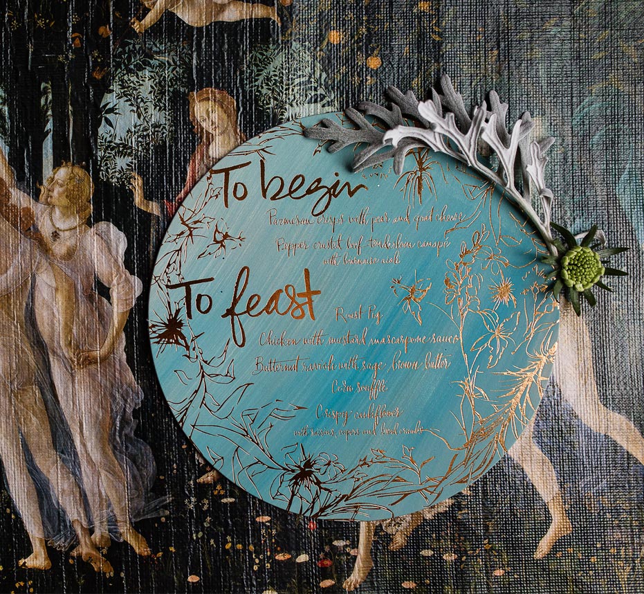
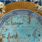
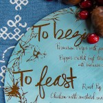
blue-gold-foil-wedding-menu
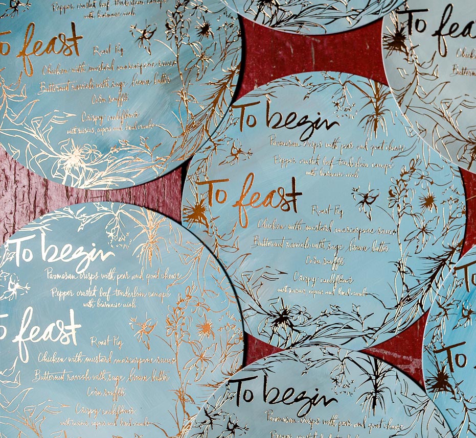
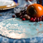
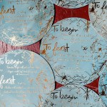
Gold foil calligraphy on hand painted double thick stock to mimic the look of an artist’s oil canvas
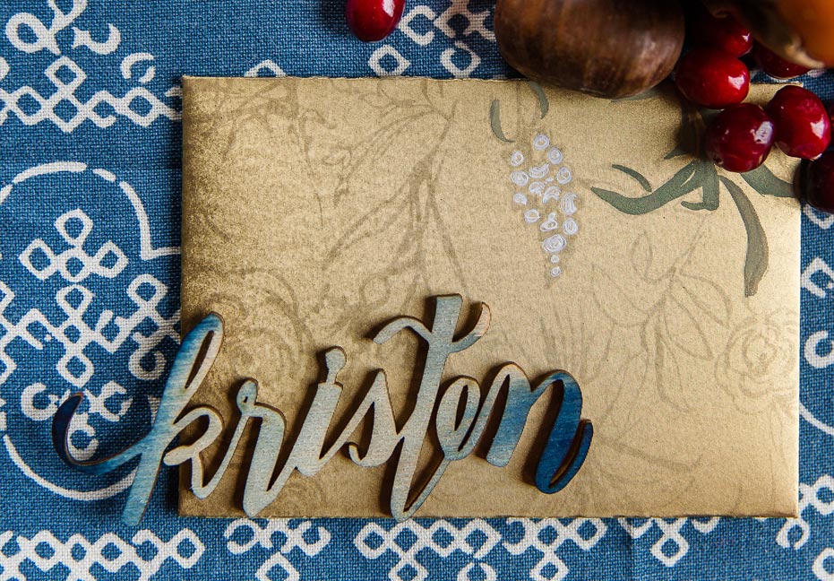
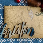
watercolor-wood-wedding-place-card
I crafted tiny envelopes with the botanical pattern flat printed in a tone on tone gold. Oh and those laser cut wood place cards??? Right???
blue-gold-foil-wedding-menu
If you haven’t noticed Momental and Designsgirl are artistic bff’s. We’re not sure what we would do without her?
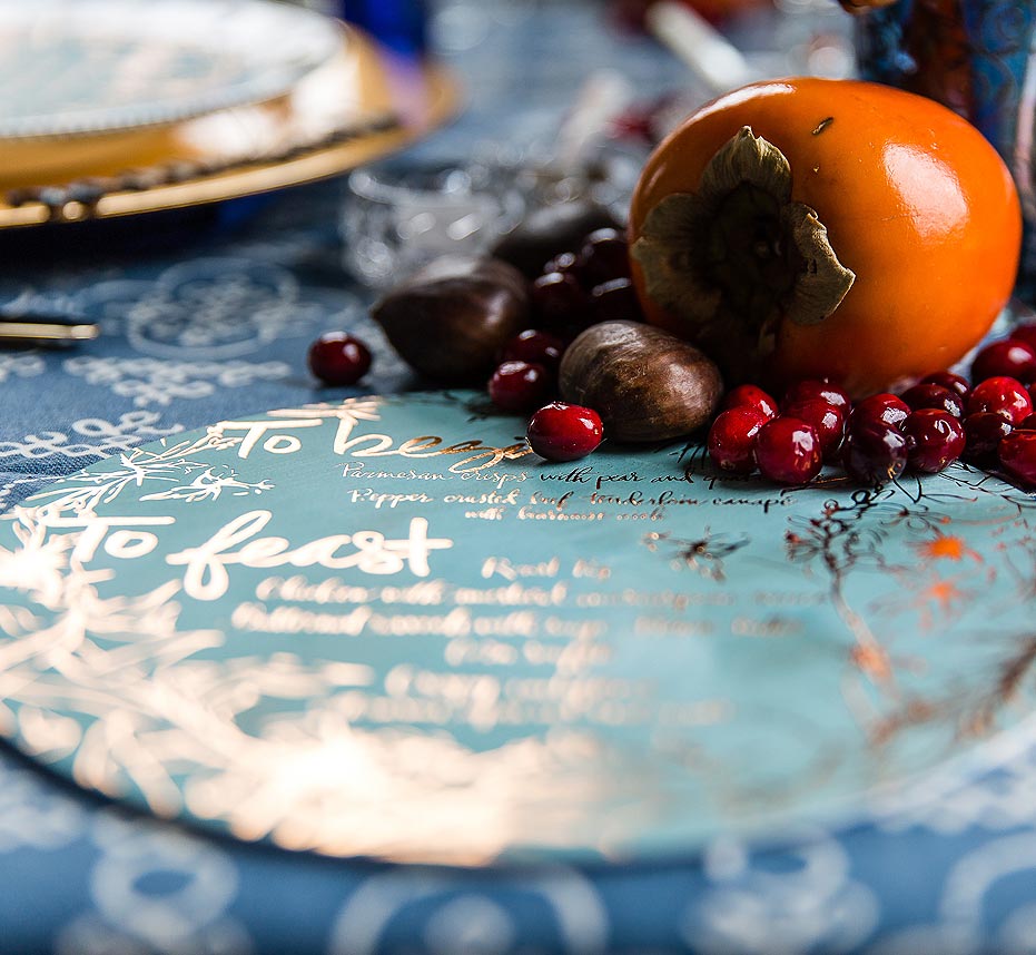
blue-gold-foil-wedding-menu
Nothing like a pretty persimmon this time of year!
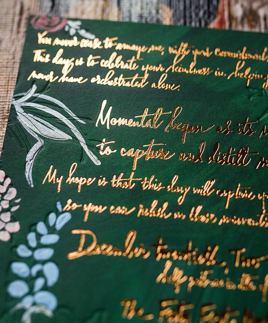
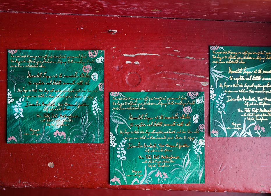
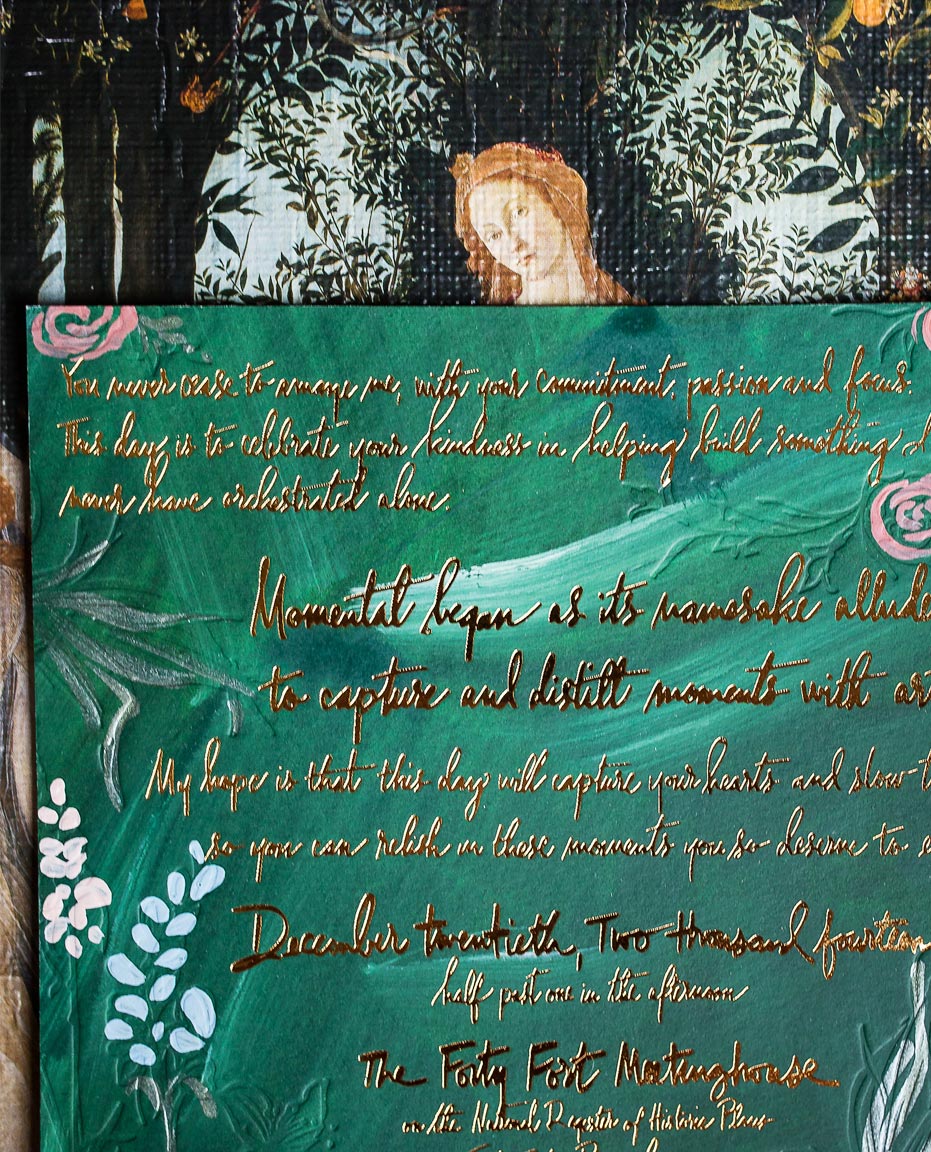
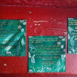
emerald-gold-foil-invite
Just like the menus, the invites’ stock was painted first and then the botanical patterns was blind letterpressed into the surface. Gold foil calligraphy to follow of course.

blue-gold-foil-wedding-menu blue-gold-foil-wedding-menu emerald-gold-foil-invite emerald-gold-foil-invite emerald-gold-foil-invite

Vendor Credits